

A version of this post originally appeared on Snow News on January 4, 2024.
There’s no shortage of websites with maps and graphics visualizing snow forecasts and the state of the snowpack.
In fact, information overload is the real challenge.
Starting up Snow News, I felt like a skier in whiteout conditions, trying to find my bearings through foggy goggles in a dense cloud of data, models, analytics, predictions, and other weather wonkery.
In an earlier post, I explained how the Winter Storm Severity Index provides an accessible overview of expected impacts from snow, ice, and wind. But that’s just one of many products from the government, universities, and other sources that offer a wealth of information about what’s happening with both near-term weather and seasonal trends.
Below, I describe some of the other sites I find most useful for tracking storms and keeping tabs on the snowpack. I’m not a snow scientist, so I’m focusing on resources that make it easy for a lay audience to catch the drift.
The sites below are all free, but there are also paid services worth looking into if you’re a total snow nerd. In my opinion, OpenSnow is by far the best source for snow forecasts, especially for skiers and snowboarders, and I’ve been a paid member for a decade (its wildfire smoke projections and other maps are also useful in summer). If you want to see tons of data and the output from weather models, WeatherBELL Analytics and Pivotal Weather are good choices.
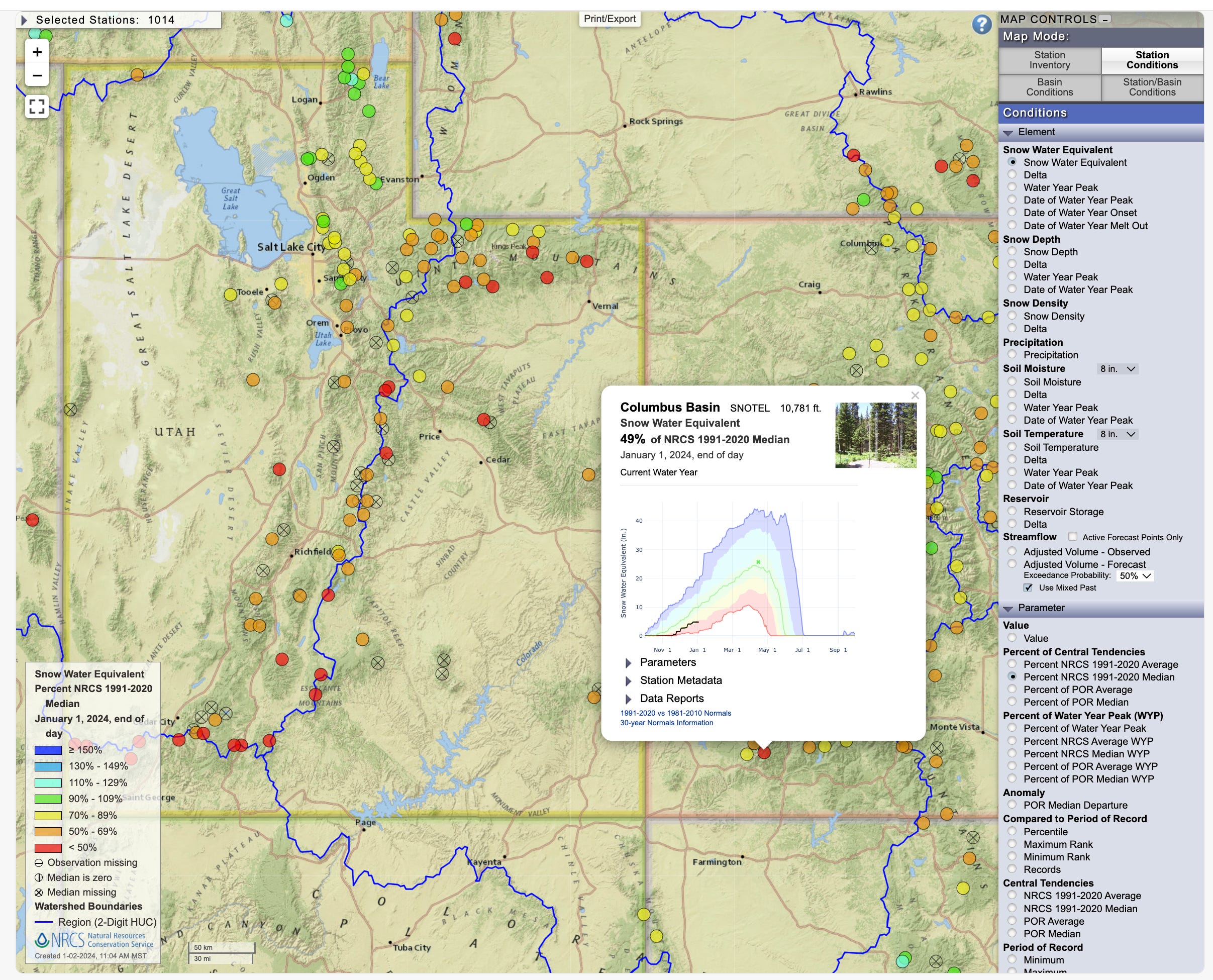
1) Use iMap to visualize SNOTEL data
First, the bad news. Three months into the water year, which starts October 1, the West’s snowpack remains significantly below average in nearly every watershed. The image below is from the Natural Resources Conservation Service’s iMap interactive, which illustrates January 1 data from automated SNOTEL stations and other sources.

The iMap tool provides a great overview of conditions in the West and lets you see data for individual watersheds or SNOTEL stations. In the images below, I’ve shown that switching from basins to stations allows you to click on a specific SNOTEL site to chart how the snowpack has fared this season. For example, the Columbus Basin station, located at 10,781 feet in the La Plata Range near me, is at 49% of the median level for 1991-2020, with current conditions shown with a black line and the median in green.
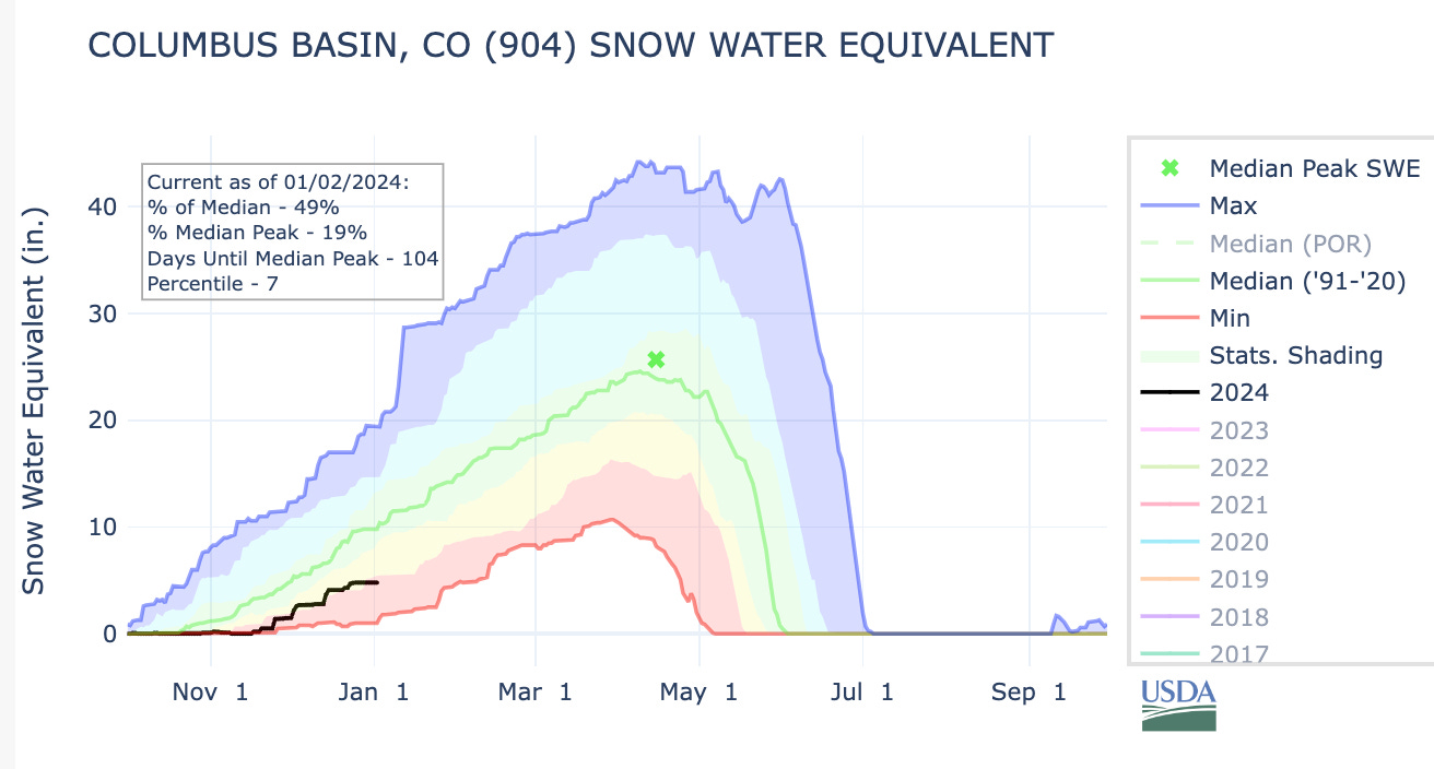
At this station, the snowpack has flatlined recently, and with 104 days to go until the median peak date of April 15, it was at the 7th percentile. Ugh. On the bright side, the forecast calls for snow to fall around here tonight, with a bigger storm expected to hit on Sunday.
If you’re monitoring conditions in California, check out that state’s own snowpack website. The summary below from the California Department of Water Resources visualizes the grim picture in the Sierra Nevada, with the statewide average at 25%.

2) Explore forecasts with a map from The New York Times
One of my favorite sites for tracking incoming storms is an interactive map from The New York Times that excels at visualizing data from the National Weather Service’s National Digital Forecast Database. For example, the November 30 map below shows the “most likely” snow amounts in Utah’s Wasatch Range, but the map can also depict the low- and high-end chances so you can get your hopes up or down, depending on your personal preference.
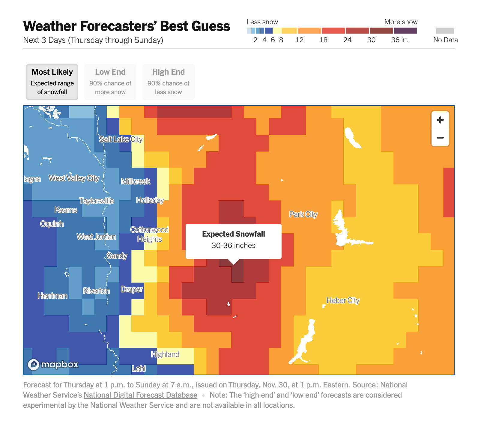
It’s easy to navigate this tool and drill down to see how the snow forecast can vary dramatically across just a few miles in the West’s undulating topography. This data viz also generates probabilistic snowfall forecasts for specific locations and zip codes, using National Weather Service data to calculate the likelihood that a place will receive a specific amount of snow, such as less than one inch, four to six inches, greater than 18 inches, etc.
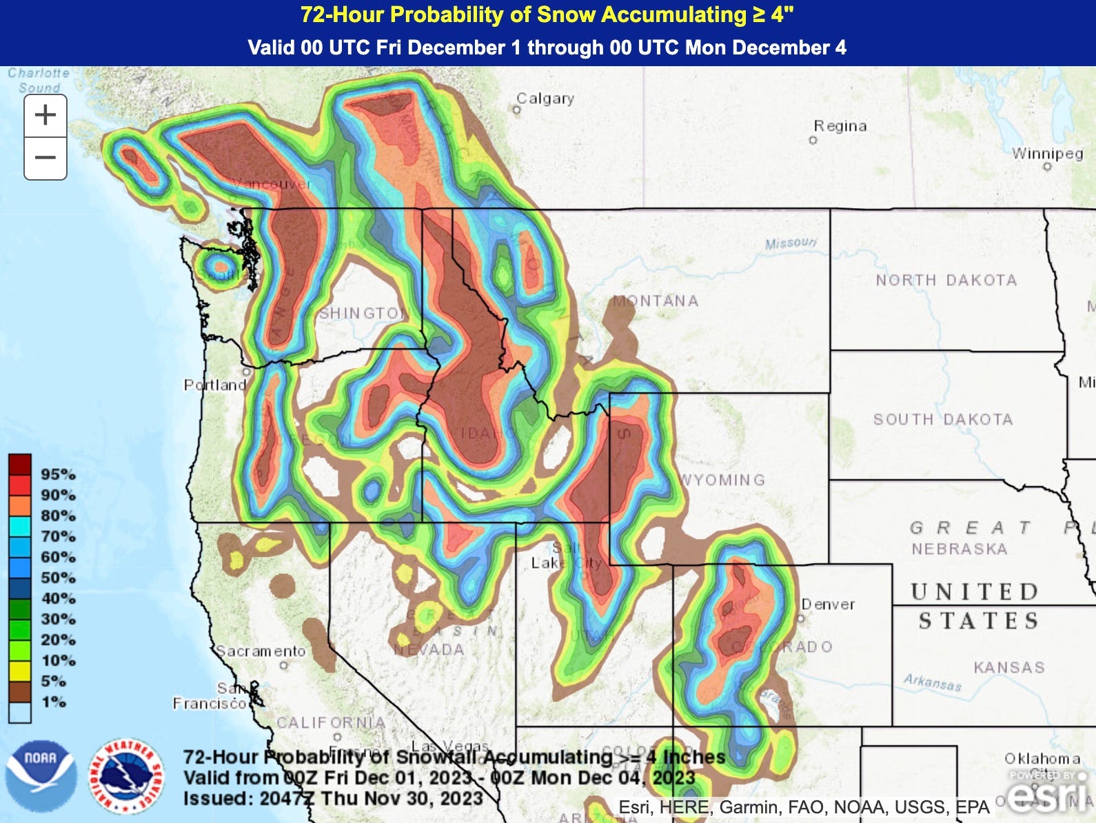
3) Track snowfall with NOHRSC
It’s a mouthful, but NOAA’s National Operational Hydrologic Remote Sensing Center is an essential source for snow data. NOHRSC’s interactive map offers a variety of snow-related data, including depth, temperature, density, and melting. You can also select data for any day since 2002. Below is an example of the snowfall during 72 hours in mid-December in southern Colorado and northern New Mexico.

As is common with federal websites, this interactive map is kinda clunky and cumbersome. The paid sites I mentioned above use NOHRSC’s data to produce more user-friendly maps, like the one below from WeatherBELL Analytics showing how much snow fell from October 1 to January 1.

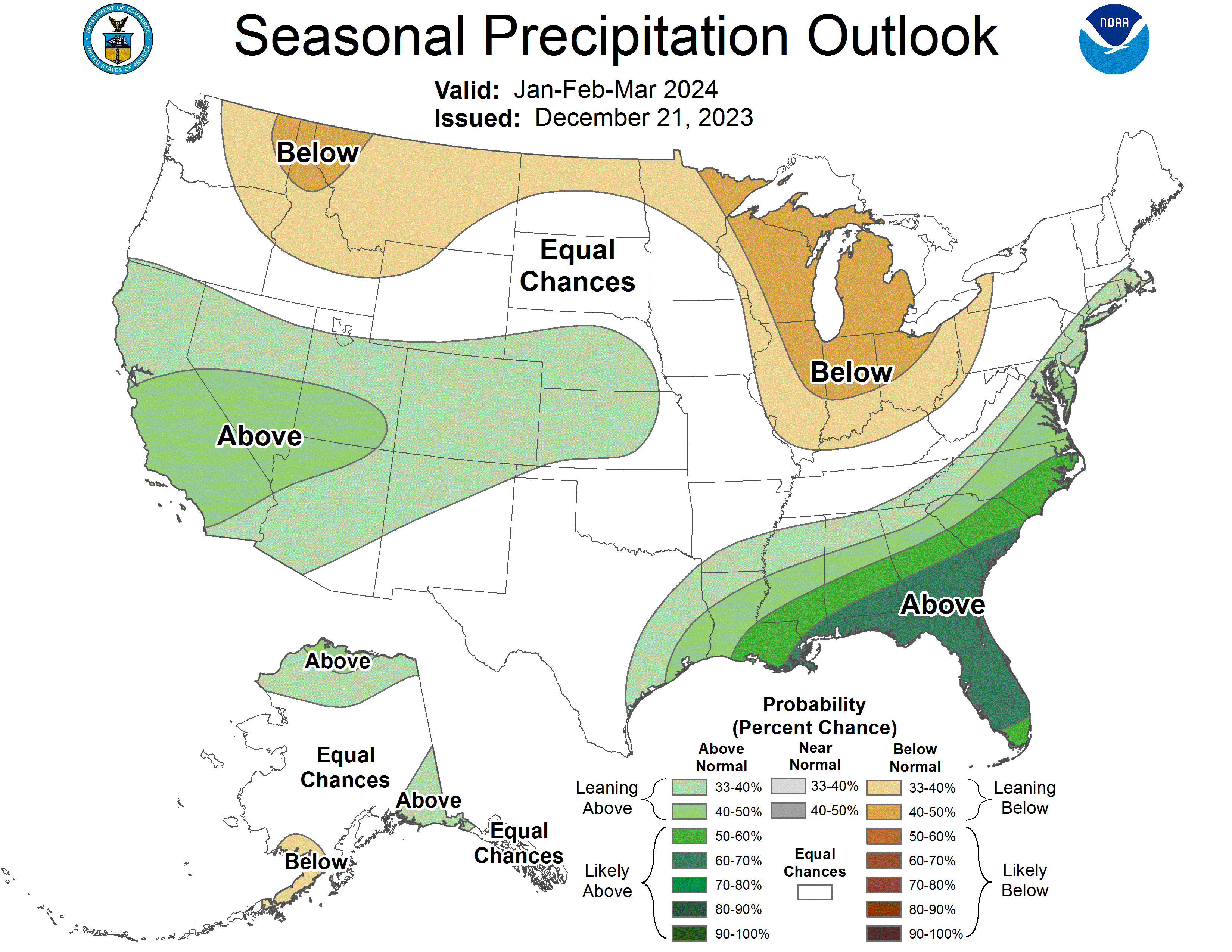
4) Keep tabs on the outlook at the Climate Prediction Center
The truth is that modern science has very little skill in predicting where and how much it’ll snow many weeks or months from now. But as I’ve noted in an earlier post, there are products by federal forecasters and other reputable sources that take a stab at long-term outlooks.
I think the best source is the federal government’s Climate Prediction Center. For what it’s worth, below are the CPC’s most recent outlooks for precipitation and drought in the first three months of 2024.

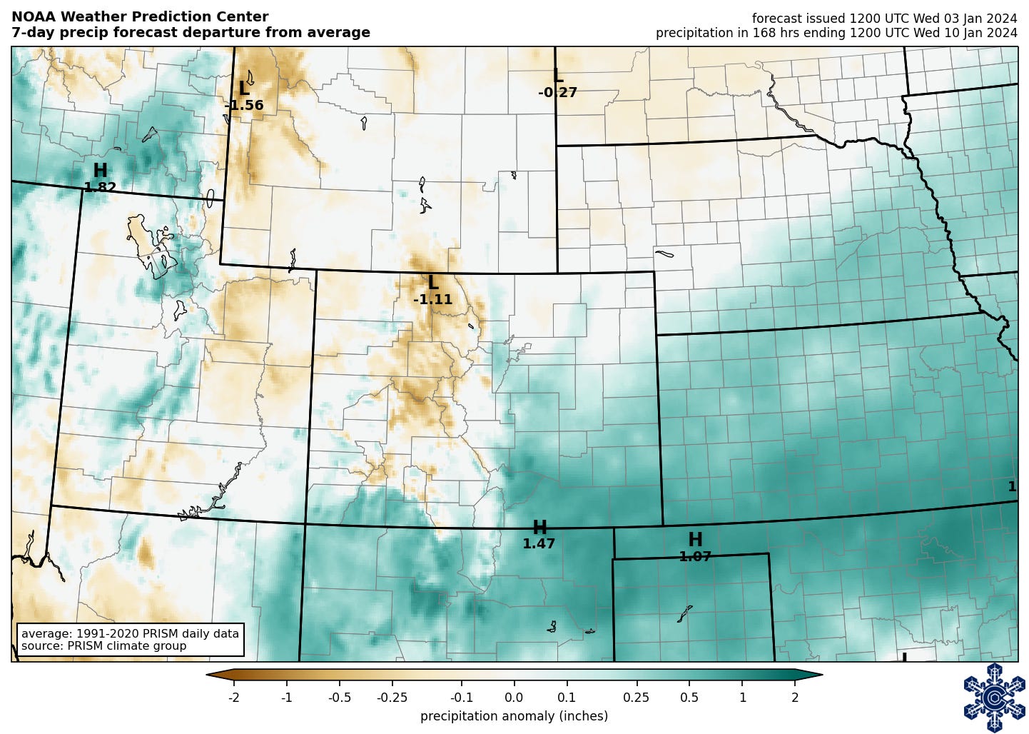
5) Gauge the probability of snow at the Weather Prediction Center
My favorite feature of this site is the map that depicts the probability of snowfall exceeding certain thresholds. For example, the December 1 image below shows the odds of at least four inches of snow falling over the subsequent 72 hours.
See this page for WPC’s winter weather forecasts, which go out to seven days and also address freezing rain.
6) See local reports from the Community Collaborative Rain, Hail and Snow Network (CoCoRaHS)
CoCoRaHS is a citizen-science effort that describes itself as “a unique, non-profit, community-based network of volunteers of all ages and backgrounds working together to measure and map precipitation (rain, hail and snow).”
Measurements from volunteers are plotted on an interactive map that has data available back to 1998. The image below shows 24-hour snowfall around Durango and Pagosa Springs on November 25.
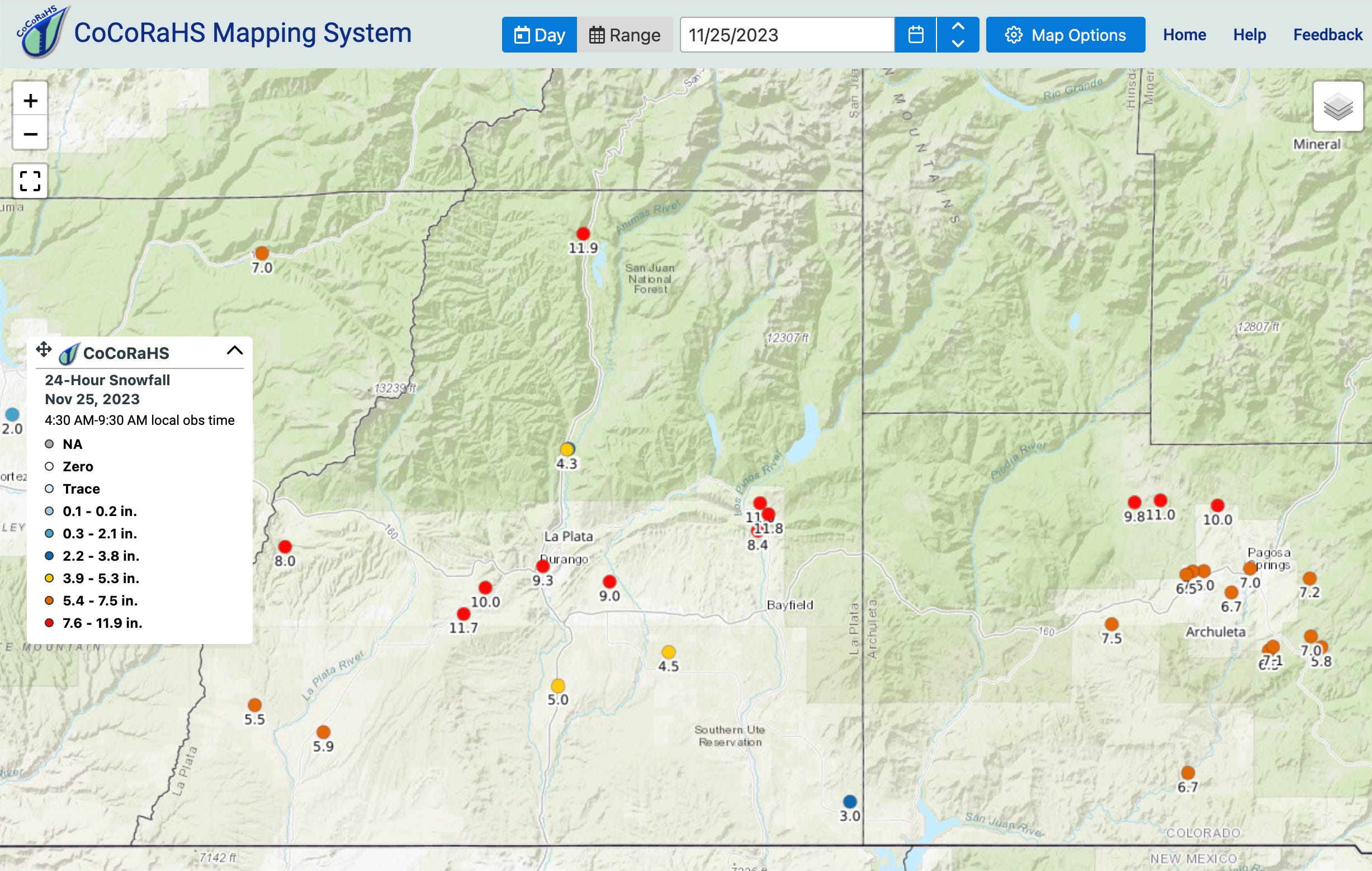
As you’d expect, big cities have a lot more observations than rural areas. See this page for more about the project and how to sign up as a volunteer.
7) Check conditions using avalanche centers
In many parts of the West, local avalanche information centers provide critical data and insights about snowfall and the status of the snowpack. Forecasting avalanche danger lies beyond the scope of this newsletter, but even if you never plan to set foot in the backcountry, these sites are still super helpful. For example, the Colorado Avalanche Information Center has weather forecasts, data from weather stations, and daily snowfall reports.
Below is the output from one of their weather models, showing the expected snowfall during a late October storm.

See this page on avalanche.org for links to other avalanche centers, and this map for a national overview of conditions.
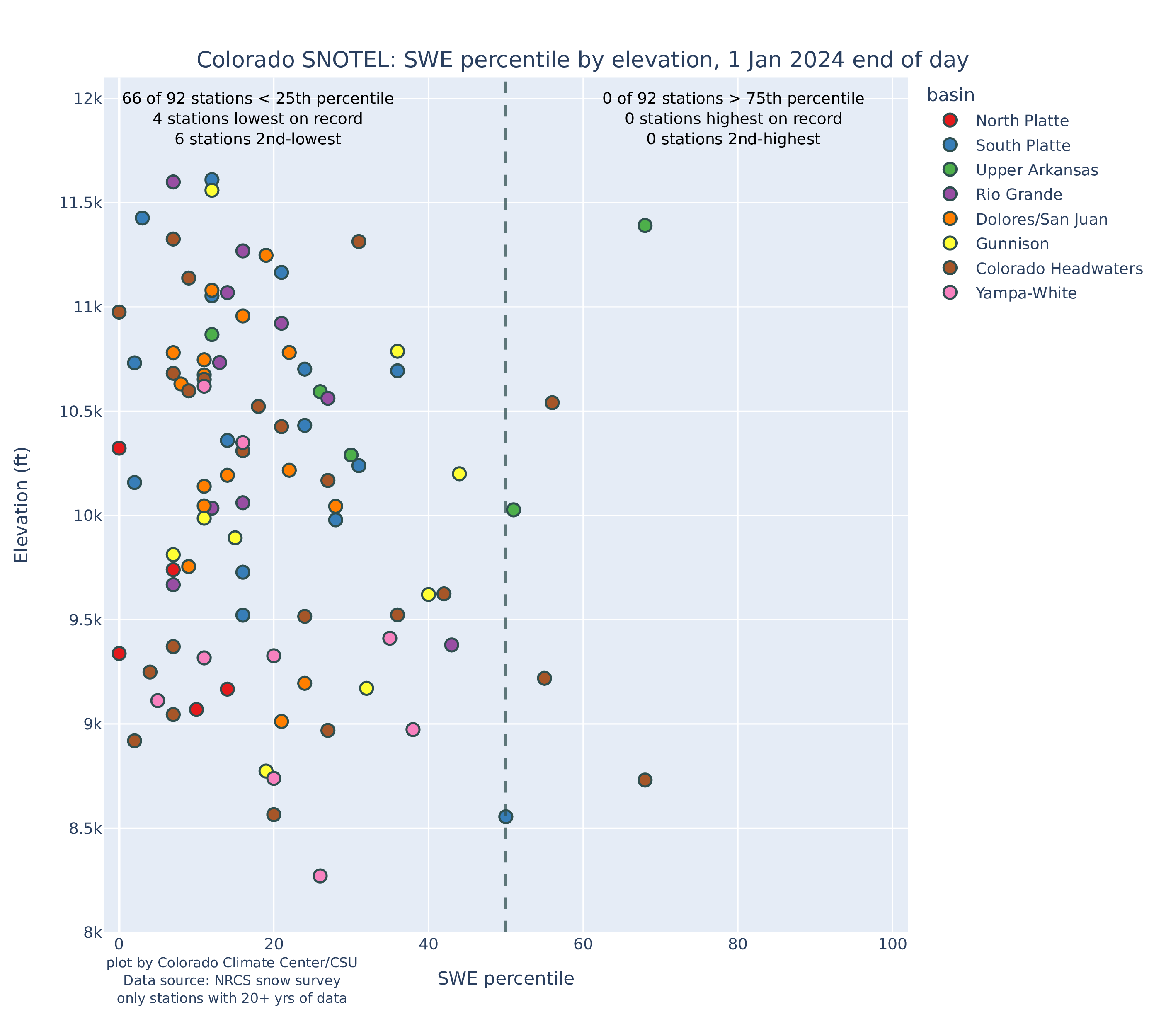
8) Consult dashboards that pull from multiple sources
Finally, several helpful websites aggregate data, maps, and graphics from various sources, offering a quick overview of what’s happening with snowfall and the snowpack.
The Intermountain West Ski Dashboard, created by the Colorado Climate Center at Colorado State University, pulls together data on recent snowfall, short-term forecasts, weather hazards, snow depth, drought, and more. Here’s an example of a graphic showing that the vast majority of SNOTEL sites in Colorado were below the 50th percentile on January 1, with the vertical axis showing elevation and the different colors corresponding to different river basins:
Below is a forecast for the next seven days, showing the expected precipitation “anomaly,” with green indicating wetter than average conditions and brown showing drier (this map shows inches of liquid precipitation, rather than snow amounts).
The Intermountain West Climate Dashboard, created by the Western Water Assessment at the University of Colorado Boulder, is another useful round-up that focuses on Colorado, Utah, and Wyoming. This is a great source for maps depicting recent temperature/precipitation data; measures of drought and soil moisture; current and forecasted streamflow; reservoir storage; and the status of the El Niño-Southern Oscillation. The site offers regular briefings on climate trends and significant weather events, including a helpful annual summary of the preceding water year. Below is a gallery of some images showing precipitation, soil moisture, and reservoir storage.


Snow News is a free multimedia newsletter that covers the science of snow and the state of the snowpack.
The Water Desk’s mission is to increase the volume, depth and power of journalism connected to Western water issues. We’re an initiative of the Center for Environmental Journalism at the University of Colorado Boulder.


