

Browse through the sports section of any newspaper and you’ll find tons of data dissecting the performance of teams and players. Flip to the business section and you’ll see a wealth of charts and figures tracking companies and economies.
But what if your local media outlet had a section devoted to environmental issues like water? Imagine pages filled with statistics, graphics and maps tracking watershed health, river flows and water use trends. One of my goals for The Water Desk is to move us toward that vision. I want to see our atmosphere, snowpack, rivers, streams, reservoirs and manifold uses of water analyzed with the same fervor we devote to batting averages, stock indices and other metrics that are routinely reported in the media.
Sure, the weather section sometimes includes information on local reservoir levels, drought conditions and other water indicators. But these sections tend to focus on short-term conditions, rather than the big picture and how things are changing. Instead, imagine data visualizations and interactive maps that are not only way cooler than any box score but also allow you to step back in time so you can find your own trends and patterns.
Introducing interactive dashboards for water issues
As we launch The Water Desk’s website, I’d like to introduce you to three data visualizations that cover the closely related topics of drought, precipitation and snowpack. There’s also an interactive on dams and reservoirs that I’ll explain in a future post. At this point, we only have dashboards for the water supply, rather than water demand, but I’m hoping we can tackle that side of the equation soon.

To create this series of interactive dashboards, I’ve worked over the years with some accomplished data experts–Geoff McGhee, David Kroodsma and Erik Hazzard. I’m not a coder, and the prospect of learning the Python language appeals to me as much as curling up with a 20-foot snake. But Geoff, David and Erik managed to figure out how to make these dashboards self-updating so they can automatically ingest the latest data.
Below is some background on how the visualizations came about and how you can use them.
If you’d like, you can skip to the visualizations themselves.
EcoWest: tracking environmental trends
Before getting into the dashboards, let me quickly explain their genesis. From 2011 to 2015, I worked as an independent evaluator of the David and Lucile Packard Foundation’s grantmaking around Western environmental issues. As part of that consulting work, the foundation asked me and my colleagues at California Environmental Associates to develop a way to track trends in the region. Our solution was to create a website, EcoWest.org, which features blog posts, data visualizations and PowerPoint slide decks summarizing a variety of indicators and topics, including water, land use, climate, wildfires, biodiversity and politics. As with The Water Desk, EcoWest was editorially independent from its funders: we had complete freedom to research and write about the issues.
While working on EcoWest, I had the great fortune to do an (unpaid) fellowship at Stanford’s Bill Lane Center for the American West, where I got to work closely with Geoff, a veteran of the multimedia and infographics desk at The New York Times, Le Monde and ABCNews.com.
To make a long story short, we decided to create a series of dashboards that track key indicators so users can not only explore the data but also embed the visualizations on their own websites.
As the Packard Foundation’s Western Conservation subprogram ended, so did the funding for EcoWest, but I decided to keep the site operational even though I wasn’t adding new content. On their own dimes, Geoff and David continued to tinker with the dashboards and make improvements, but I’ve always regretted not doing more with the dashboards or disseminating them more widely.
Now, with The Water Desk underway, we’re relaunching the EcoWest dashboards and incorporating them into our website, which Geoff helped us build. We hope these interactives will be a useful tool for journalists and others who are interested in reporting on water.
Drought dashboard
Watch the West move in and out of severe drought
In recent years, drought has been in the news frequently as dry spells gripped large parts of the West. There are many ways to define and track “drought,” but the best known of these measures is the U.S. Drought Monitor, which reports conditions across the country and is widely reported in the media.
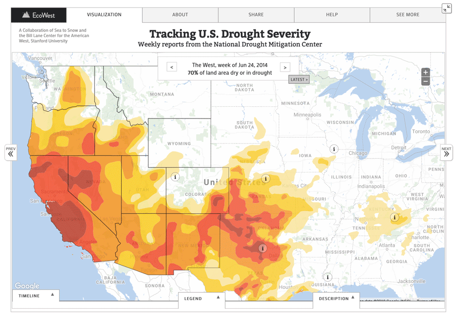
The Drought Monitor publishes a weekly map on Thursdays that shows which parts of the country are in drought by using five color-coded categories. There’s “abnormally dry” (D0), which indicates areas going into or coming out of drought, then four escalating levels of drought: “moderate” (D1), “severe” (D2), “extreme” (D3) and “exceptional” (D4).
When you arrive at the drought dashboard, you’ll find yellow boxes akin to sticky notes that explain some of the features. If you’d like to go big, click on the icon in the upper right corner to expand the interactive.
Interactive map: current drought conditions
The U.S. Drought Monitor is jointly produced by the National Drought Mitigation Center at the University of Nebraska-Lincoln, the United States Department of Agriculture and the National Oceanic and Atmospheric Administration.
The drought levels represent a composite index that includes many indicators: the Palmer Drought Severity Index, the Standardized Precipitation Index and other climatological inputs; the Keech-Byram Drought Index for fire; satellite-based assessments of vegetation health and various indicators of soil moisture; and hydrologic data, particularly in the West, such as the Surface Water Supply Index and snowpack levels. For more on how the maps are made, see this piece by Grace Hood at Colorado Public Radio.
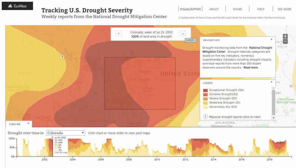
Colorado emerges from a brutal drought
Below are two views from the dashboard that focus on Colorado. The top image is from July 23, 2002, when Colorado and other Western states were in the grips of a brutal drought. That summer, the 138,000-acre Hayman Fire became the largest in Colorado’s recorded history. On the Colorado River, inflows to Lake Powell were about one-quarter of normal.
Fast-forward 17 years to the bottom graphic, showing July 23, 2019, and Colorado was virtually drought-free after one of the wettest winters in decades wiped out a dry stretch that was particularly bad in the southwestern corner of the state.
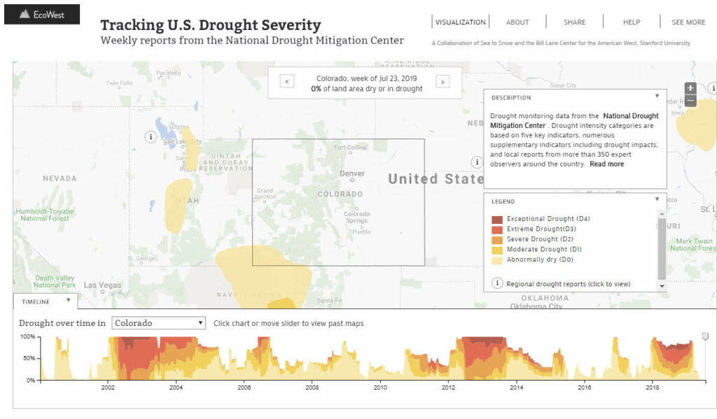
In the bar chart below the map, clicking on different dates will transport you to that week’s Drought Monitor as well as bring up a tooltip that shows you what percent of the area was in the various categories of drought. On July 23, 2002, one-third of Colorado was suffering from exceptional drought and the other two-thirds of the state were in extreme drought; by contrast, on July 23, 2019, just 3 percent of the state was classified as abnormally dry.
If you use the dropdown menu above the chart–or click on a state on the map–you’ll be brought to a chart showing drought conditions over time for the selected state or region. Clicking on the timeline or dragging the slider will update the map display to the selected week.
The “i” icons on the map indicate that a narrative about that location or region is available for the selected week. Clicking on the icon will reveal a text box with a discussion and forecast written by the U.S. Drought Monitor analysts.
If you want to embed this dashboard on your site or share the view you’ve created, click on the “share” button in the upper right and you’ll find options for republishing and distributing the visualization.
Precipitation dashboard
From atmospheric rivers to parched plains: visualizing rain and snow patterns
Precipitation patterns are obviously a big part of why droughts come and go, but it’s important to remember that temperature can also be important and create so-called “hot droughts” in which a higher evaporation rate is a leading player in the meteorological drama. For example, a seminal 2017 paper by Bradley Udall and Jonathan Overpeck, found that a big chunk of the 2000 to 2014 drought on the Colorado River was due to higher temperatures, not just reduced precipitation, with future warming projected to cut the river’s flow even further.
While the drought maps change relatively slowly and the shapes are only updated once a week, precipitation is much more dynamic and fine-grained. I’d love to tell you we have a constantly updating map of the country showing where every drop and flake has fallen over the past five minutes, but we’re not there yet. Instead, our precipitation maps focus on the monthly average.
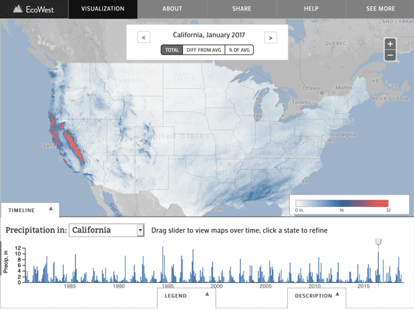
When you arrive at the precipitation dashboard, you’ll be greeted by an intro screen with sticky notes explaining the features. The map shows how much rain and snow fell every month in the contiguous United States, from 1981 to the present. We offer a couple of ways to slice and dice the data:
- Total precipitation
- Difference from the long-term average
- Percent of average for that month
For example, the screenshot below shows March 2019 precipitation as a percent of the monthly average. It was a wet month here in Colorado and neighboring Utah, but the weather was much drier than normal along the Pacific Northwest coast. If you click on one of the states, you’ll bring up a bar chart showing how that month’s precipitation compared to the 30-year average and the rest of the year.

The data for this dashboard comes from the PRISM Climate Group at Oregon State University, which uses weather station data and a sophisticated model to report monthly and daily precipitation for the contiguous United States at a resolution of about 800 meters (around a half-mile). Including all that data would make for a painfully slow map, so we’ve reduced the resolution to four kilometers (about 2.5 miles) per pixel.
The timeline below the map shows monthly rainfall totals for the selected geography. By default, the chart shows the average monthly precipitation for the contiguous United States since January 1981. Using the dropdown menu above the chart or clicking a state on the map will redraw the chart to show the precipitation over time for the selected state.
As with our other dashboards, you can embed the precipitation map on your own website or share via social media by clicking on the “share” button in the upper right.
Snowpack dashboard
Measuring the frozen reservoir vital to Western water supplies
Here in the American West, our water supply hinges on the snowpack that accumulates each winter in the high country. Snowmelt supplies the bulk of the flow in many Western rivers, so the volume of snow in the mountains is an obsession not only for ski bums like me but also for water managers, farmers, paddlers and others downstream.
Truth be told, our snowpack dashboard doesn’t exactly come alive with breaking news in August. Like most sports, the snowpack has a season. But even in the middle of summer, you can use the snowpack interactive to look back at past years.
Our snowpack map shows the daily estimates for the contiguous United States since October 2003. Using the dropdown menu above the chart or clicking a state on the map will redraw the chart to show the snowpack estimate by day for the selected state.
This data set is based on output from the National Weather Service’s National Operational Hydrologic Remote Sensing Center (NOHRSC) SNOw Data Assimilation System (SNODAS).
You have two options for displaying the snowpack data:
- “Monochrome” paints the map with varying intensities of white
- “False color” uses blues and purples to depict the snowpack’s snow-water equivalent (SWE), a measure of its water content
Rather than insert a screenshot, I clicked on the “share” button to create some HTML code for the map embedded below, which shows data from March 11, 2019, when the nation’s snowpack was near its peak.
Below the map you’ll find a chart showing the volume of the snowpack going back to 2004. As with the drought and precipitation maps, you can zoom in on specific states.
Another feature of this dashboard is a line graph that shows the snowpack’s rise and fall by year. In the visualization embedded below, the blue line marks the 2018-2019 winter.
At first, the West’s snowpack season seemed unremarkable, but in February and March, a series of potent storms led to some of the deepest conditions in recent memory and a ski season to remember.
We hope folks find these dashboards useful, and we’d appreciate hearing from anyone who uses or embeds them. Please feel free to send us feedback or reports about bugs by emailing waterdesk@colorado.edu.


